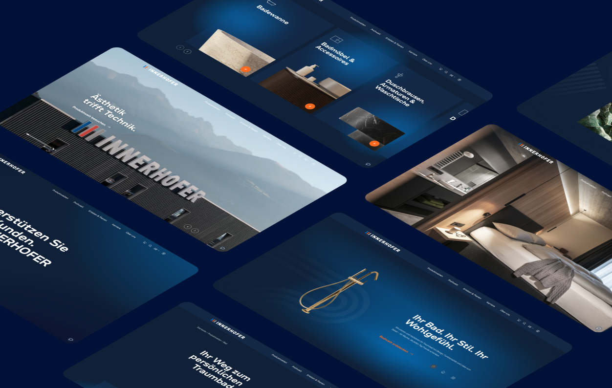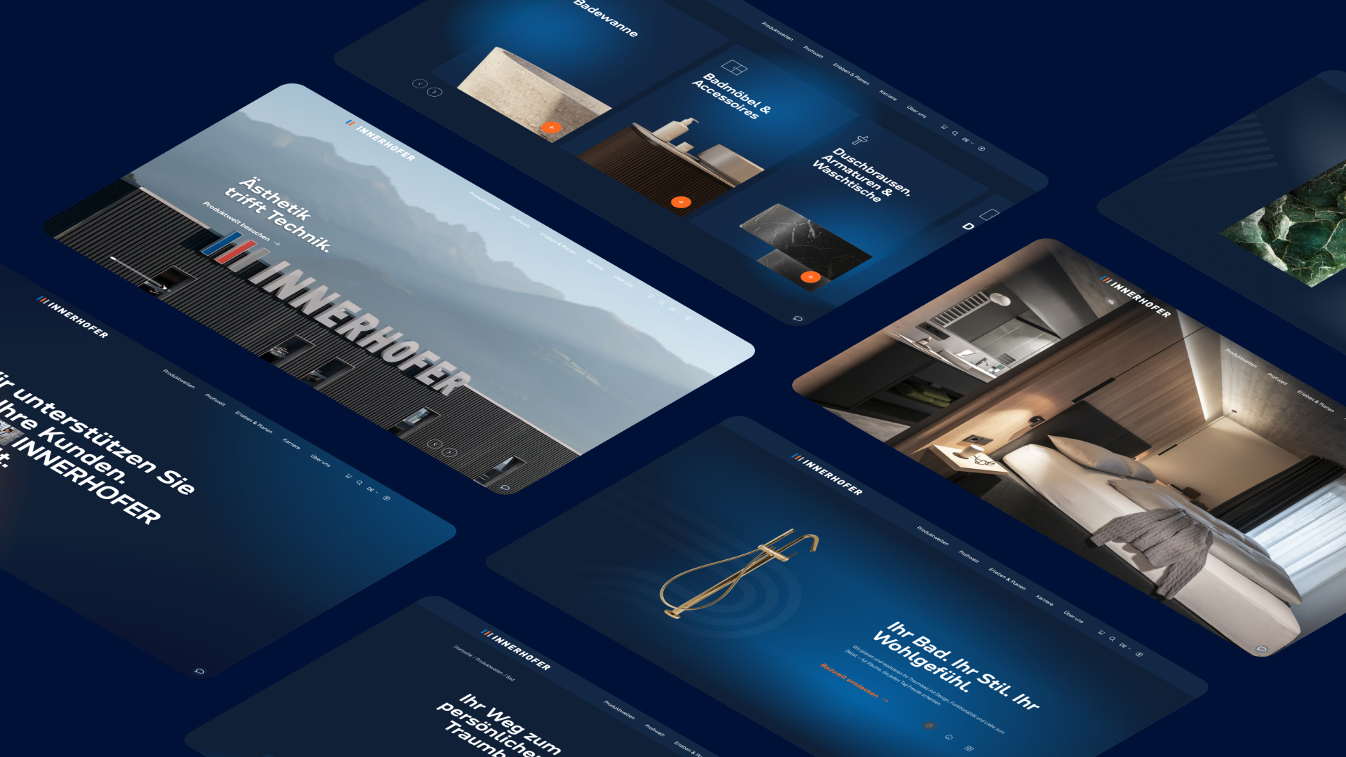
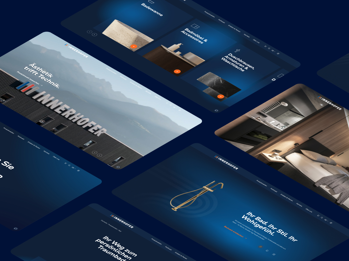
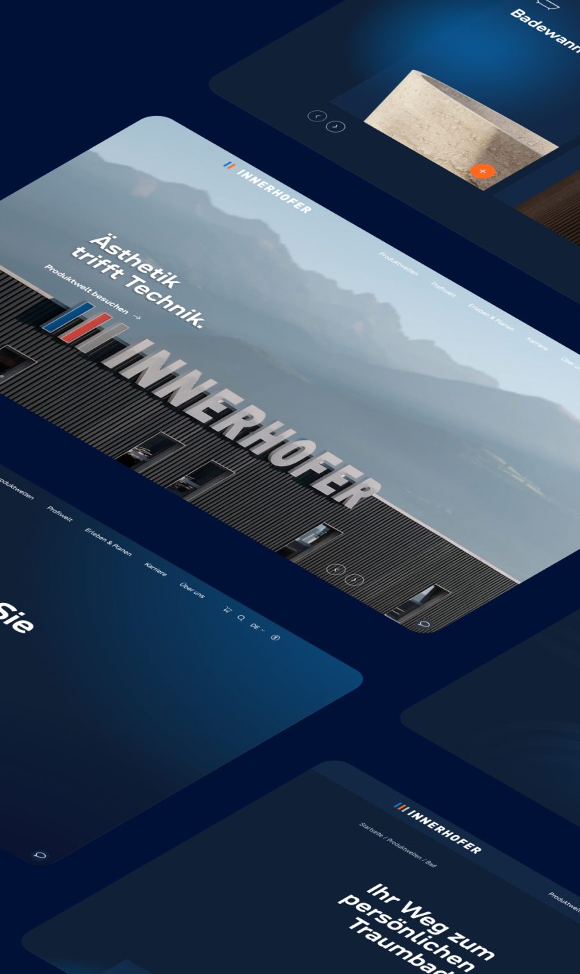
INNERHOFER - Rebranding with character
In close collaboration with INNERHOFER, we have consistently developed the branding of the brand and taken it to a new level. Instead of the neutral, restrained look often found in the sanitary industry, the brand is now deliberately making a statement: striking navy blue, dynamic transitions and a modern, interactive layout give INNERHOFER a clearly recognisable appearance with a strong character. The design not only looks contemporary, but also consistently conveys the new brand understanding - powerful, high-quality and with a focus on personality and expertise.
It was not just about a visual reorientation. We completely rethought the digital user experience and created a clear structure that intuitively supports both B2B and B2C target groups. Content, product worlds and services are now specifically organised according to relevant needs - faster to access, easier to grasp and significantly more interactive.
A central component of the digital transformation is the jointly developed AI-based style advisor, which guides customers to the right bathroom style via an interactive funnel. This is complemented by a digital brand book that serves as a binding source for design, tonality and brand guidelines. This ensures that INNERHOFER's brand image remains consistent across all channels and scalable in the long term.

Employer branding
After the visual and digital modernisation, it was clear that the next step had to make the core of the brand visible - the people at INNERHOFER.
In the second part of the project, we therefore developed an employer branding campaign that deliberately focussed on authenticity. Under the leitmotif "Heart + Hand", employees were not only portrayed, but also interviewed. The interviews were filmed in a high-quality style and then seamlessly integrated into the website. This creates insights that bring the company to life rather than staging it.
For the photographic motifs, we staged the employees with water effects. The shots were specifically edited to emphasise movement, dynamics and the connection to the theme of water. The result is powerful and authentic at the same time.
By integrating the interviews and images across all recruiting touchpoints - from the careers website to social media and applicant communication - we created an HR presence that positions INNERHOFER as a modern, appreciative and future-orientated employer. Not as a campaign, but as an attitude.
The new appearance focuses on darker backgrounds, colour gradients and dynamic elements - a clear break with the usual white of the industry.
The user answers a few short questions and automatically receives suggestions for suitable bathroom styles, including inspiration and orientation.
It provides a clear overview of all brand guidelines, colours, fonts and downloads - ideal for partners, media and internal teams.
"Herz + Hand - INNERHOFER und Du." shows real employees, their stories and their connection to the company - emotionally and authentically.