
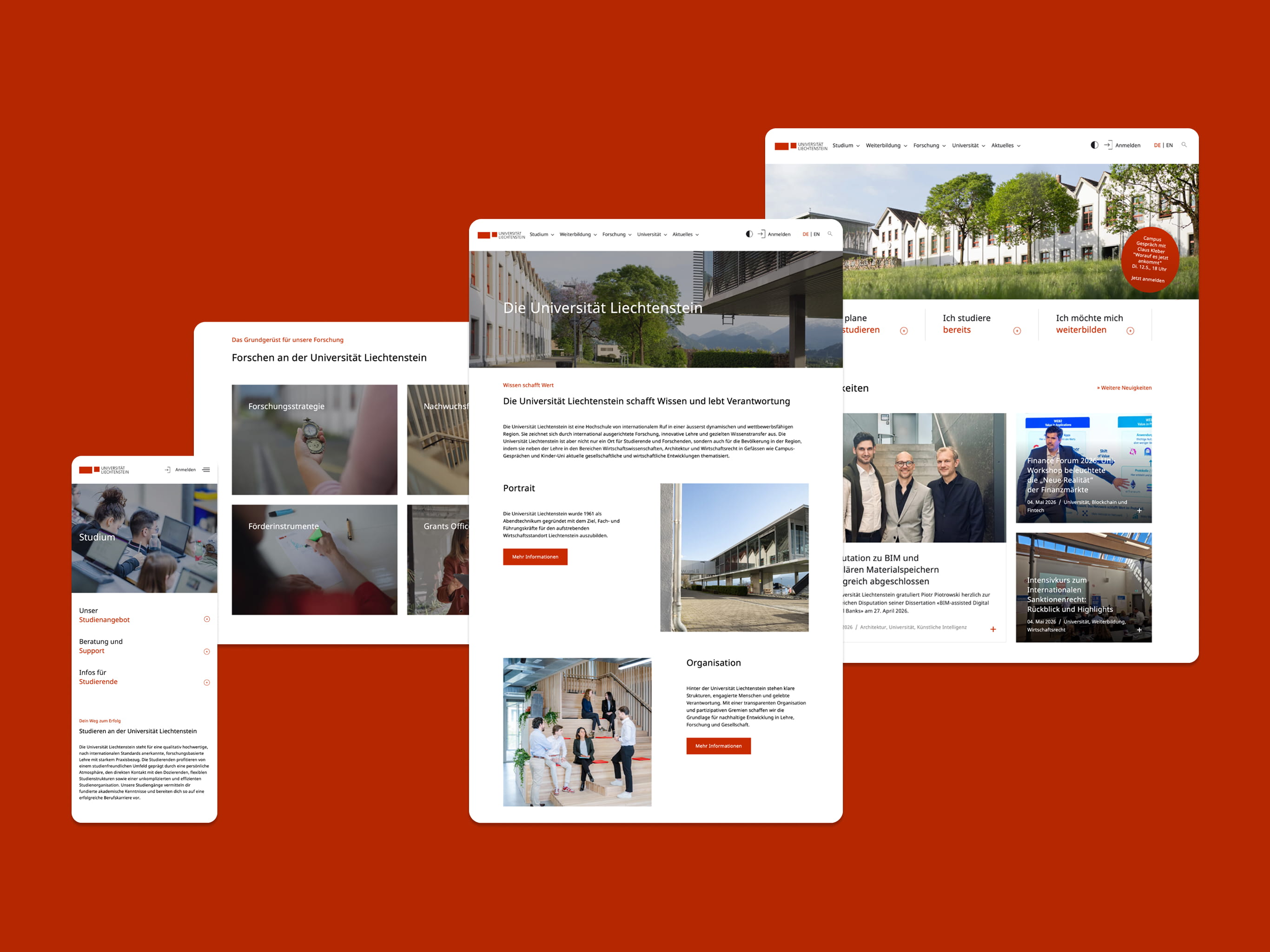
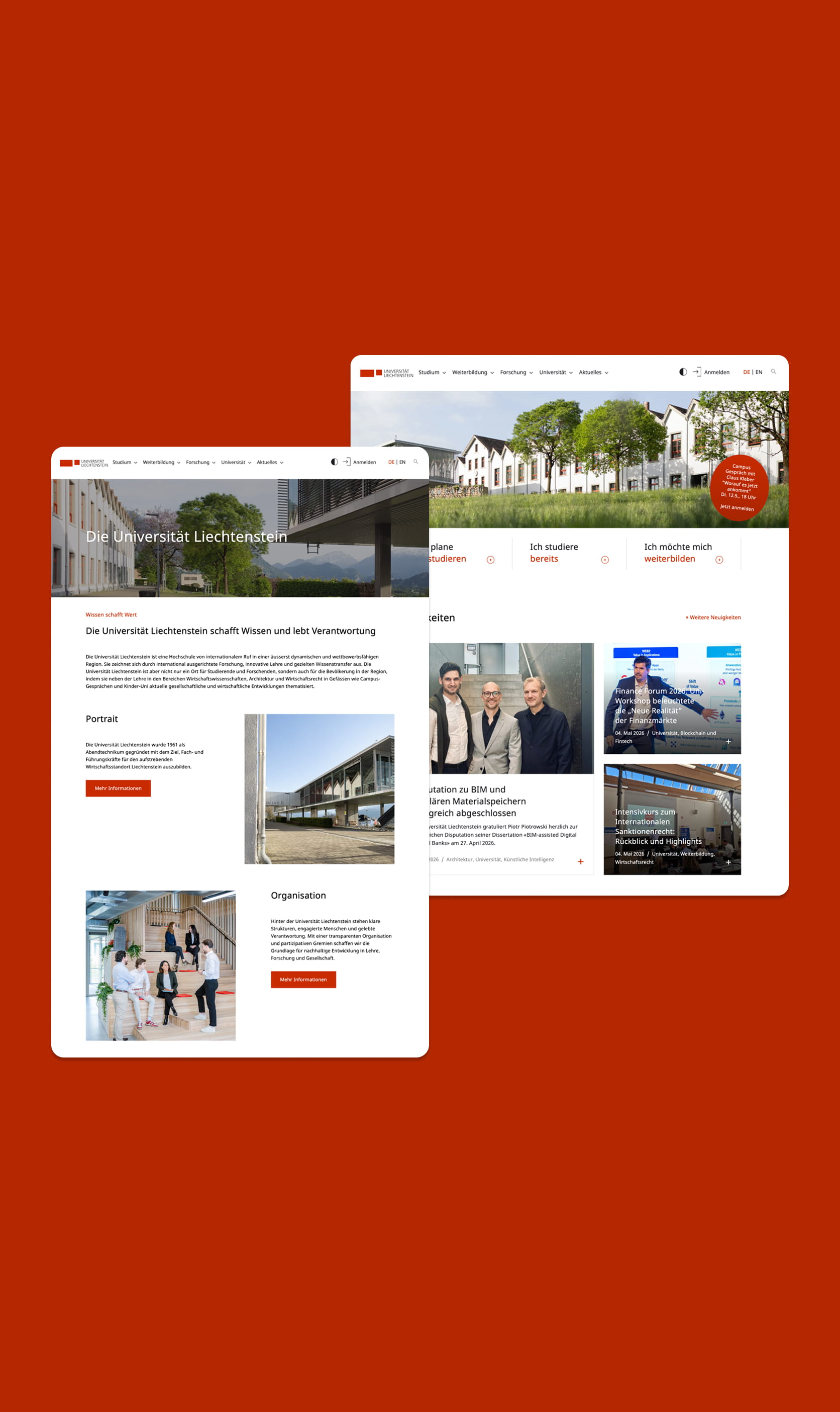
Website relaunch of the University of Liechtenstein
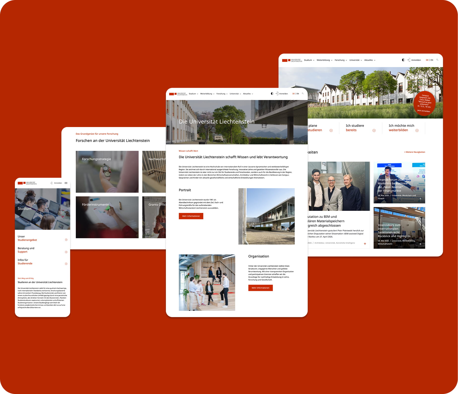
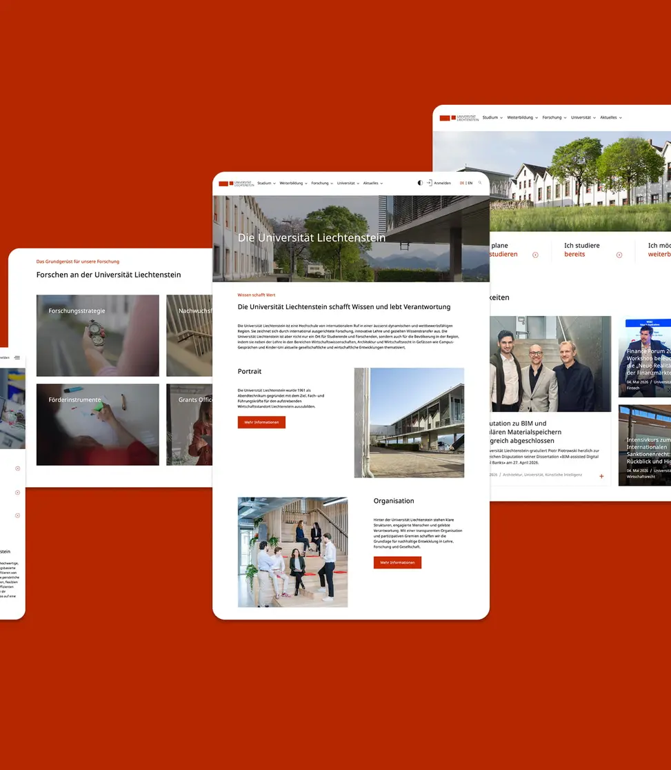
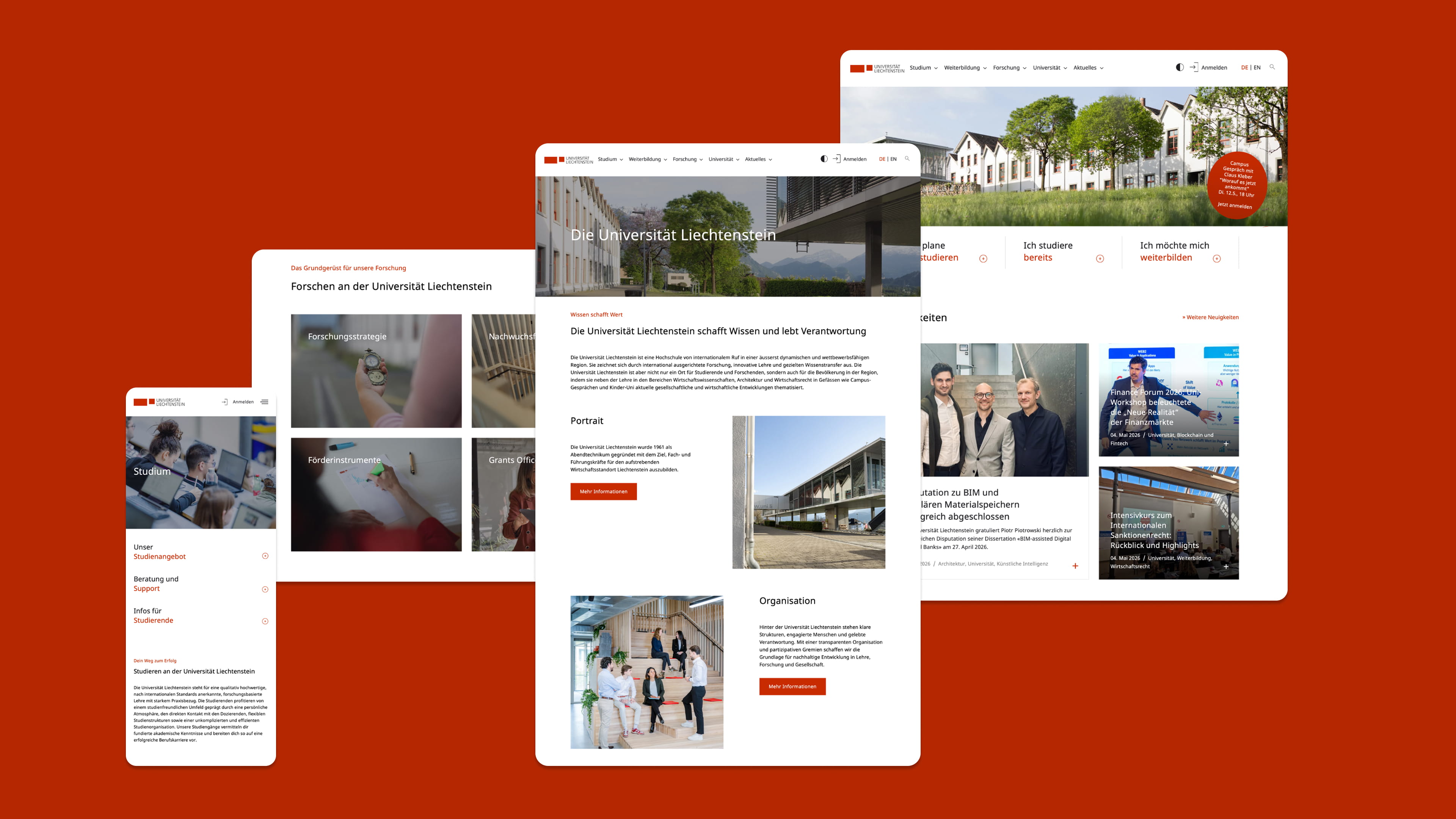
Established website structures often involve complex content, long click paths and unclear processes. This is precisely where the conceptualisation phase for the relaunch of the University of Liechtenstein began. We fundamentally rethought the sitemap and navigation, reduced them and translated them into a clear digital setup. The result is a modern website with a clean structure, contemporary UX/UI design and significantly improved usability for all users.

Focus on usability
At the centre of the relaunch was the question of how to translate a grown and complex university website into a clear, modern digital system. Together with the teams at the University of Liechtenstein, we analysed existing structures, content and user needs and developed a new UX/UI concept with significantly better orientation and clearer content workflows.
Navigation was fundamentally simplified, central content was structured in a more targeted way and important functions were visually emphasised more clearly. Interactive elements and precisely placed call-to-actions now help users to access relevant information more quickly and navigate through the website more intuitively.
A digital presence with a future
The relaunch was not just a design project for our team, but also a structural and technical one. The result is a modern website with a clear information architecture, contemporary UX/UI design and a digital basis that is maintainable, scalable and user-centred in the long term.
With the new setup, the digital presence of the University of Liechtenstein has been sustainably developed - both in terms of use and in the management and structure of the content.
Beim visuellen Relaunch galt es, die bestehende Identität der Universität Liechtenstein zu bewahren und gleichzeitig zeitgemäss weiterzudenken. Die vertraute Farbwelt blieb erhalten, wurde jedoch durch modernere Nuancen, grosszügigere Layouts und eine reduzierte Designsprache ergänzt.
Die bisherige Website war über Jahre hinweg gewachsen – mit teils bis zu 14 Navigationsebenen. Das neue Konzept reduziert diese Komplexität auf maximal vier Levels und schafft damit eine deutlich intuitivere Nutzerführung. Vor allem Studieninteressierte sollen schneller zu den Informationen finden, die für ihre Entscheidung relevant sind: passende Studiengänge, Inhalte, Voraussetzungen, Bewerbungswege und nächste Schritte. So entstehen weniger Klicks, klarere Wege und ein digitales Erlebnis, das konkrete Orientierung bietet.
Indem ihre visuelle Identität respektiert wird. Die Farbwelt der Universität blieb erhalten, wurde aber um zeitgemässe Nuancen und ein reduziertes Layout ergänzt.
Ja. Accessibility wurde von Beginn an tief in den Design- und Entwicklungsprozess integriert. Dadurch ist die Website heute zugänglicher und besser nutzbar für unterschiedlichste Anforderungen und Endgeräte.