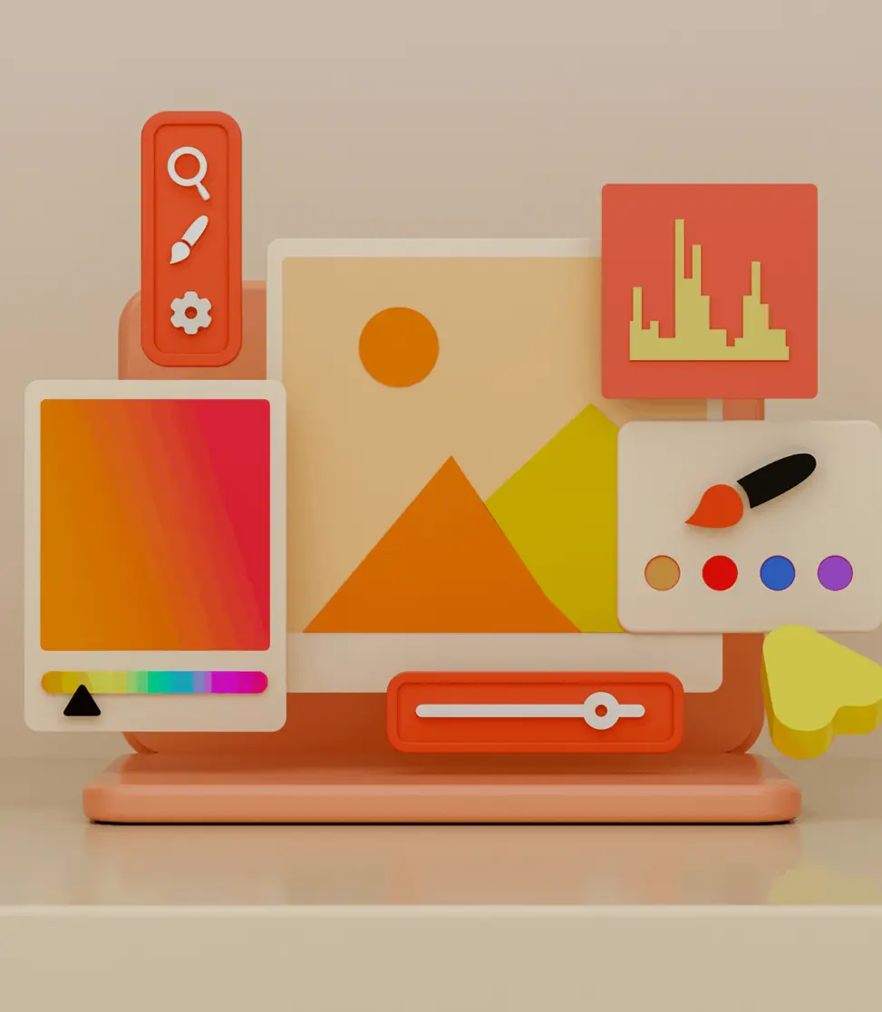
UX- and UI-Design
User experience design and user interface design are two of the most significant factors in the success of a digital product. It is not for nothing that Apple is one of the most successful brands in the world, which places a strong focus on the user experience and the interface or application design. The simple logic and clear structure of an Apple product makes it easy for any user to set up and operate their iPhone. For example, the AirPods automatically connect to the phone when the case flap is opened, while competing products first require navigating through the menu until the headphones are connected. It is exactly these little things that make the big difference in the user's experience with the product.
To begin with, let's briefly define the two areas, as they are often mixed together. While the user experience refers more to the "look and feel" of the product and the experience of it, the user interface design describes the general application and structure logic.

User Experience Design
The user experience is the interface between the human and the computer or the website or product. The experience and sequence on the website should therefore be as clear as possible, so that the user has a clearly defined path and is always aware of what they are about to do. The visitor always looks for the easiest way to reach the goal, whether on a website or in real life. Therefore, as soon as he doesn't understand what he has to do in the process or it seems too complicated, the user will either take a shortcut or leave the process. Because of this, the process should be designed to be as simple as possible with little to no hurdles. This image describes the user experience perfectly: The architect has come up with a nice path including a hurdle - and everyone walks past it.
Image source: tumblr Dirks Blog

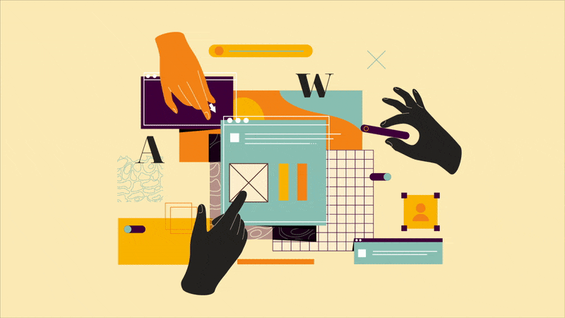
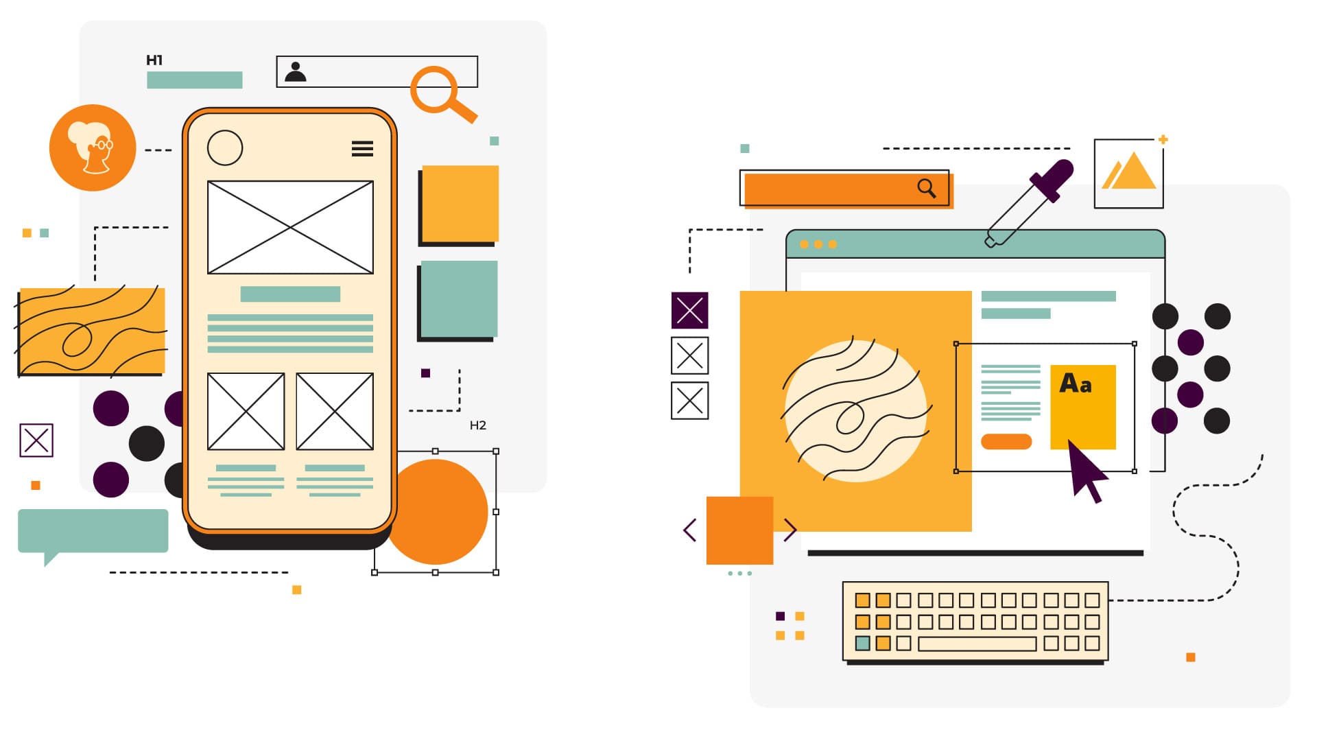
User Interface Design
The user interface is the inverse of the user experience. Here, it is a matter of defining which options must be given to the user so that he or she can reach the goal without having to think about it. In order to generate a good and clear interface design, this should be presented in a reduced form and ideally rely on familiar elements. For example, the classic wastebasket on the computer is a perfect interface design element. It translates the real world 1 to 1 into the digital world, so that every user directly understands what he or she can do with the wastebasket: namely, "throw away" or "delete" data - just like in the analog world. In the following pictures you can see examples of bad interface design. For example, buttons in the elevator of a hotel have been retrofitted with Braille, without any space having been originally planned for this. As a result, every hotel guest now has to look intensively until he finds the right button.
Image source: Facebook / The Interaction Design Foundation
Basic design guidelines
Both design areas together therefore determine the experience and quality that the user experiences when visiting the website and ultimately brings directly in connection with the company. To avoid any discrepancies, there are eight basic design guidelines that should be followed when creating or revising a website.
Re-Use
Use text and element conventions that the user already knows and thus logically describe the functionality. This saves explanations within the process. For example, every user knows what function is behind the "Send" button when it is placed on a form.
Active feedback
Always inform the user about what is currently happening and what will happen next. This way, the user is always in the picture and does not lose the overview. This is especially important for processes that take some time, such as uploading a document to a website. Here, a loading animation should be displayed in the meantime.
Support Undo & Redo
If the user clicks on something, it is essential that he always has the possibility to quickly leave the process or return to the place where he was before. A subsequent re-entry must also work well and the visitor should be able to resume his process at any time without much effort.
Simples Wording
If the website relies on familiar terms for interactions, the user knows what he can achieve with the respective option without having to think much. For example, terms like "copy" or "save" are common descriptions that everyone knows. Therefore, they never need to be explained and the user does not have to find out what is behind these functions.
Low error rate
Especially when visiting a website for the first time, there should be as few errors as possible built in to convince the potential customer. Therefore, it is important to define the process in such a way that any error messages are avoided. This can usually be achieved with simple definitions, such as marking the required fields as "mandatory".
Newbies and Pros
We distinguish between different user groups, because there are newbies and advanced users in every field. The advanced user normally does not want to go the way of the newbie, because he already knows the system. If we make the comparison to the computer again, a keyboard shortcut is the ideal example here. A new visitor can copy a file by right-clicking and then paste it, whereas an advanced user can copy and paste the file directly using a keyboard shortcut.
Minimal Design
The structure should be defined clearly and understandably, so that everyone can find their way around without having to actively think a lot about the structure first. The interaction areas remain compact and reduced in order to define an ideal sequence. We start from the minimal approach according to the question "What is the minimum set that the user needs to fulfill his goals?" After the minimum requirements are defined, additional elements can be added to the design - but they should have a much smaller presence.
Define to-dos
The items to be completed must be displayed clearly and understandably in order to achieve the goal. In order for the user to fulfill the process, he should be guided through it in such a way that no ambiguities arise. A simple example of this is the check-out. Here, the user is always shown the next step so that he never has to ask himself what to do now.